Design Parade 6

Jean-Louis Jabouin takes a look into the Design Parade 6, as well as its designers.

Art Rotterdam

Jean-Louis Jabouin discusses Art Rotterdam and how exciting it was.

Some New(ish) AutoCAD News

Some AutoCAD apps for those who love making things in the third dimension.

Megacon Photos

After a great weekend, Jean-Louis Jabouin talks about the highs and the lows.

What inspires you to design?

Jean-Louis discusses some great designs that he uses for inspiration.

Tuesday, November 30, 2010

DLXS Lecture: David Carson, January 12, 2011!

DLXS Presents... David Carson
Wednesday, January 12, 2011
6:00 PM


David Carson - is an American graphic designer. He is best known for his innovative magazine design, and use of experimental typography. He was the art director for the magazine Ray Gun. Carson was perhaps the most influential graphic designer of the nineties. In particular, his widely imitated aesthetic defined the so-called "grunge typography" era.


- Aiga (American Institute of Graphic Art)


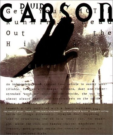
For those of you wondering, the DLXS series are a series of lectures started by my friend, Peter Soutillo, from leaders or actors of influence within the film, gaming, and of course, graphic design. EA, Nickelodeon, guys from those companies have already lectured. But this could be the greatest one of all, this is a definite must-see for the hungry Graphic Designer. David Carson, as we all know, is one of the most influential Graphic Designers of all time, with his outspoken and vibrant typography illustrations, as well as his work on Ray Gun magazine. He also brought along a different philosophy to text treatment that many Graphic Designers still follow today: Text should be used as an editable shape, and should be applied within the design. He also utilized the text on the screen and made them aesthetically pleasing. He made design with them. Funny enough, I hated his work last year. I was a firm believer of structure within design, so his work simply gave me a bit of a headache, to be frank. Going into into skateboard illustrations, I then realized that maybe a little chaos can work. I began studying up on his work, as well as made a few mockups of  his style, and I ended up finding his past compositions to be much more enjoyable than first noticed. Here's a solid example of his work:


Whenever I want actual art produced through Illustrator and InDesign, I look to him and (everything else to Paul Rand) first. While he was grunge, his style can be used by any and all Graphic Designers. Meet you there!

Saturday, November 13, 2010

Inspirations of the Moment - Paul Rand


Motionographers have Saul Bass. Print Designers have Paul Rand. This man was a godsend for us Graphic Designers overall. There is a quote from Louis Danziger that pretty much says it all for his legacy in graphic design.


     He almost singlehandedly convinced business that design was an effective tool. [. . .] Anyone designing in the 1950s and 1960s owed much to Rand, who largely made it possible for us to work. He more than anyone else made the profession reputable. We went from being commercial artists to being graphic designers largely on his merits. 

     He was best known for his groundbreaking logo design, producing logos for IBM, UPS, NeXT, Enron, ABC and Westinghouse, just to name a few. He attended Pratt Institute, Parsons the New School for Design, and the Art Students League to harness his craft. While his logos are his more popular, his earlier works in page design were just as powerful. He designed page layouts for Esquire magazine, and was so talented, they offered him a job as Art Director of the magazine. He initially refused, but he landed the job at the age of 23. During that time, one of my favorite print design pieces was created. Direction was an cover he created in 1940-ish, that involved a barbed wired cross. The sheer minimalism, as well as strong symbolism made it one of the most inspiring piece for me as a Graphic Designer.

Learning logo design, one of his quotes rung true. "Don't try to be original. Just be good" was one of the earlier quotes we learned from in our lecture slides, and while at the time I didn't particularly agree, it was a strong testament to how a man must be to become successful. If you look at his IBM campaign, another favorite, you can see that he wasn't trying to go over anyone's head. It was simple and damn it, it worked. I mean, an eye, a bee, and an M. Seriously? A logo that pretty much epitomized everything logo  design stands for in the rulebook of proper logo design was probably his ABC Network logo. At the time, it was one of the more minimalist logos out there, and when he was asked this, he stated that "a logo cannot survive unless it is designed with the utmost simplicity and restraint". That was the very first lesson our instructors taught us, and I utilize this principle to this day.

Thanks, Paul.

Wednesday, November 3, 2010

Inspirations of the moment - Gwen Vanhee

During my tenure at Full Sail, I spent 3 months learning motion graphics. It is a very, very juicy occupation or hobby to get into, because of the sheer flexibility your creativity (and apps) can take you. With that said, during my first month, my Instructor noticed my love for expressions and mentioned something that is honestly one of, if not the, most creative programming applications today. Processing is an open-source programming application that is many people use for images, and interactions. Definitely give it a shot. What I notice about Gwen Vanhee is that most of his work is very much ambience with skill. His pieces shine when next to nothing is on the screen, except for the main asset. I may not know too much about the guy, but whenever I am in a rut, I always go to Vimeo and check his stuff out. They remind me that I'm thinking too much. Let the work flow.


Gwen Vanhee - Audiosculptors.V
A great demonstration of what processing can do with some creative thought. It's clean, but it holds a strong personality. The pure green shades varying between purples and oranges. Wondering if any 3D is or can be used in this, because it gives off that vibe. Ah well. The color choice is spot on, and while I'm not the biggest fan of the music, it really fits. Definitely worth checking out.


Gwen Vanhee - Sousbleu
My favorite of his Processing work. The ambient music is perfect with his style of work. It allows for the illustrations to blossom and live on its own. Speaking of illustrations, as an Illustrator, I am impressed. Of course, vector art with a hand-drawn touch to them reach me easier than most other forms of graphic design pieces.


Gwen Vanhee - Flightpatterns
A definite second for me. I love the slickness of this composition. From the introduction transition to the ending, I feel it captures the spirit of aviation quite well. Of course, it's all subjective, guys. I could just be some lazy nerd typing on his keyboard thinking I know the deeper meaning of certain material, haha. Whatever it may be, check it out.


Gwen Vanhee - Audiosculptors.III
His newest one on Vimeo, apparently. It is much more slower aesthetically than most of his other work, which is just the way I like it. Adds a dimension later on, which only adds to the beauty of the piece. Not my favorite, but it is still worth a mention. He used Actionscript III for this one by the way....